Quantcast
Channel: The Faceoff
Viewing all 773 articles
Browse latest View live

Center Ices In Video Games - Part 1

$
0
0
Introducing part one of a lengthy series that compares center ice designs that appear in video games to their real life counterpart. Thanks to a lot of help from CF92 and Cory, a lot of hunting and capturing has been done to make this project possible. Each part will breakdown the graphics from a single game and show off the success and failures of each recreation with a simple graphic. As the years progress I will likely do more nit-picking as in theory, the details should be more accurate as years go by and technology advances.


Lets start with NHL All Star Hockey 95 which was released in June of 1995. This date means that they should have had an idea of what the center ice looked like for the 94/95 season, though it seems that some were based off of the previous year.


What If Word-marks Were On Ice?

$
0
0
The NHL has had a habit of putting NHL Faceoff logos on the ice past the blue lines each year for the first week of the season. These logos seem rather pointless, but they do prove that the NHL does not consider logos in this area to be a distraction. So I had a thought, what if teams could replace those pointless logos with their team word-mark, all year long? (Or at least during regular season until the Playoffs logos come out.) Here are a few examples of what that might look like. Just a little extra team flavor added to the ice.


EA Sports NHL 14 Rinks

$
0
0
As the launch date for NHL 14 draws closer. we are following the ice accuracy closely. Here are rink graphics for what we have seen so far. This will be updated as more become available.


New Arena For Red Wings in 2017

$
0
0
The Michigan board has given approval for a new downtown arena for the Red Wings. A state board on Wednesday unanimously gave the go-ahead for a new Red Wings hockey arena in downtown Detroit to be paid for in part with $284 million in tax dollars even as the broke city works through bankruptcy proceedings.

Red Wings owner Mike Ilitch has long wanted a replacement for the 32-year-old Joe Louis Arena located a few miles away. The new complex would be close to the Lions' Ford Field and Tigers' Comerica Park near Interstate 75 and Woodward Avenue.

Under the plan, the authority would own the arena and event center complex. The Red Wings' owner would have exclusive rights to use, manage and operate it, and hold naming rights.

Olympia Development, owned by Ilitch and his wife, said the funding split for comparable major sports complexes in other cities in the past decade has averaged 75 percent public and 25 percent private.

Construction of the arena is anticipated to be done by 2017. It's also expected to host other entertainment events. No design has been made public.

Here is the approximate location of the new arena site:

CF92 Builds Us A Scoreboard

$
0
0
CanuckFanatic92 has been at it again. This time he has created a scoreboard that features out site all over the board. He used the old Kiel/Savvis Center scoreboard because of my love for the St. Louis Blues. I thought it was so cool and wanted to show it off, so here it is...

Be sure to check out all of his NHL scoreboards at http://canuckfanatic92.tumblr.com/

Texas Stars To Celebrate Anniversary

$
0
0
The Texas Stars are going to ring in their fifth anniversary season with a special logo on their jerseys and at center ice. According to a release from the Stars, the logo at center ice will be an adaptation, so the following concept will not be exactly what center ice will look like, but perhaps give you an idea of where they are headed.

Center Ices In Video Games - Part 2

$
0
0
Introducing part two of a lengthy series that compares center ice designs that appear in video games to their real life counterpart. Part 1 can be found here.


My first NHL game was NHL Faceoff 99, so 989 Sports games will always be a fond memory for me. Now lets take a look at a few center ices from some of their games.

NHL Faceoff 98


NHL Faceoff 99


NHL Faceoff 2000


NHL Faceoff 2001


NHL Faceoff 2003


Stadium Series Ice Predictions

$
0
0
With the release of the first Stadium Series logo (New York), I have assumed that the other cities would have similar if not identical logos. I have made a few concepts of what I think the center ice designs may look like. The only change in logos I really expect to see is perhaps a change in color scheme. The New York logo is obviously catered to the Rangers, unless it was just a happy accident.


Get Creative And Submit A Concept!

$
0
0

Here is your chance to see your concept art on our site! Help us make the concept section bigger and better than ever.

Panthers Scoreboard Under Construction

$
0
0
Photo by @GeorgeRichards
UPDATE: Construction has begun on the frame for the new BB&T Center Scoreboard. The scoreboard will be ready in time for the Panthers home opener.


It's an announcement that Florida fans probably thought would never come. The Broward County Commission has voted to fund the new scoreboard which will be unveiled at the Panthers home opener for their 20th anniversary season this fall. That also opens up speculation about an anniversary logo at center ice but we will save that for another day.  The photo attached is a rendering of what they are planning however at this point a vender has not been selected.

Jersey Thoughts From Sharks Fan

$
0
0
I was going to do a write up of my thoughts on the Sharks jerseys, but as we have a Sharks fan working here at Frozen Faceoff, why not get his thoughts instead. Cory Gibson had the following thoughts on the new jerseys.


My first impression was ''I strongly dislike the lack of striping at the bottom'' as they just remind me of a number of RBK 2007 designs (Toronto, Edmonton, Dallas) which I never was enamored with. Thankfully these jerseys don't have any piping on the side, so that's a plus.

It's a clean look, which I think is probably inspired by their black alternate. The main characteristic all three jerseys share is they're all one solid color (Teal, White and Black) so that's some neat synergy, I guess.

Overall, I think it's an okay set. It's design is rather minimalist in nature, but I don't think it's horribly offensive or anything either.

Probably like a B- or B if I were to give it a letter grade


MSG Transformation Updates - Part 2

$
0
0
8/22/13: More work on the bridges. The floor is covered with plywood and work continues around the perimeter.


To view older photos and updates from Phase 3 Transformation, click here.

All About The NHL Goal Horns Part 2

$
0
0
Here it is, Part 2 of the goal horn information as promised. A few teams failed to respond to my requests for info.

Click here for Part 1

Minnesota Wild - Xcel Energy Center
Horn: Real
Type: Kahlenberg Q3
Location: Mounted just above the corner of the arena where smoke is emitted after each goal.
Additional Info: Many people take photos of the smoke assuming that the goal horn is in the picture, but often it is in plain site but just outside the photo.


Montreal Canadiens - Bell Centre
Horn: Real
Type:  Airchime M3H - only two highest pitched bells blowing, lowest is fouled.
Location: These horns are powered by a large compressor and air tank and are mounted on the technical grid above the scoreboard at center ice.
Additional Info: We do not have a recording of it, many have tried to imitate and some have gotten close, but each horn has it's own personality.
Source: Game Production Crew


Nashville Predators - Bridgestone Arena 
Horn: Real
Type: Similar to a Kahlenberg f-3
Location: Mounted in the rafters above the south end of the arena.
Source: Fan Relations


New Jersey Devils - Prudential Center
Horn: Real
Type: Kahlenberg Cruise Ship Air Horn
Location: Mounted in the catwalk above the scoreboard.
Additional Info: The horn from the meadowlands was a recording that sounded completely different.
Source: Event Production Director


New York Islanders - Nassau Coliseum
Horn: Real
Type: Kahlenberg T2
Location: Somewhere up in the rafters. I was not given the exact location.
Additional Info: "During the games, I sit up in the press box (near the blimp) to direct the game. Once the Islanders score a goal, I push a button which is electronically hooked up to the horn. Each time I want to blow the horn, I push and hold down the button to have the horn last as long as I want it to."
Source: Game Operations/Event Manager


New York Rangers - Madison Square Garden
Horn: Recording
Additional Info:  Hard to swallow the fact that the Worlds Most Famous Arena has a fake goal horn. Here is what I know about the situation. "The old goal horn from prior to the 1990s still resides in the arena, but it has not been used since the Goal Song came into play. The goal horn is now part of the recorded music that goes right into the Goal Song. You would not be able to spot the [old] goal horn from seats in the arena, so it's probably not worth being distracted from a game to look for one.”
Source: NYR Webmaster


Ottawa Senators - Scotiabank Place 
Horn: Real
Type: Airchime M3H - Only bottom two bells blowing, third bell is fouled.
Location: Mounted in the rafters above center ice.
Additional Info: The goal horn is an original VIA horn consisting of three horns. It sits high up in the rafters above center ice. “Our pattern is two longs, two shorts, and a long. Occasionally I'll do three or four shorts depending on events (like Alfie's 400th) but that's the standard that I was taught. It's more difficult than it sounds because attempting to meld the long & short so they're continuous, but distinct is difficult. My first horn ever was AWFUL. So much that my partner's phone rang and it was a friend of his wanting to know what had gone wrong.”
Source: Goal Horn Operator - You can read more about it at http://www.silversevensens.com


Philadelphia Flyers - Wells Fargo Center
Horn: Real
Type: 2 Kahlenberg S-203C Air Horns
Location: High above center ice up in the catwalk.
Additional Info: Once triggered, the sound pressure level will exceed 140dB, producing a powerful, low frequency blast, reminiscent of a cruise ship.


Phoenix Coyotes - Jobing.com Arena
Horn: Real
Type: Kahlenberg D2 x 2 (360° bracket)
Location: Mounted to the bottom of the rafters above one of the faceoff dots in the neutral zone.
Horns are located to the top right of the scoreboard.


Pittsburgh Penguins - Consol Energy Center
Horn: Real
Type: Airchime KMJ (!!) This is musically the prettiest!!
Location: Hanging down from the rafters on one end of the ice.
Additional Info:  This is the same horn that was used at Mellon Arena.
Source: There is a video about the horn from when Consol first brought the horn over. View it here


San Jose Sharks - HP Pavilion 
Horn: Real
Type: Kahlenberg Triton S-120
Location: The horn's physical location is on the catwalk above 207. You can't really see it unless you are in the catwalk above the ice.
Additional Info: While no known photo of the actual Sharks horn exists, here is a video showing a horn of the same model. Youtube
Source: Director of Even Presentation


Saint Louis Blues - Scottrade Center 
Horn: Real
Type: 2 Kahlenberg S-203C Horns
Location: Both are located in the catwalk above the scoreboard at center ice.
Additional Info: They point in opposite directions. The horns came from an old ocean-liner that was being scrapped. They are actually only set to 40% airflow. Imagine if they were at 100%!
Source: Scottrade Staff


Tampa Bay Lightning - Tampa Bay Times Forum
Horn: Real
Type: Kahlenberg S-203C
Additional Info: I believe we secured it from one of the shipyards here in the Port of Tampa several years ago.
Source: Team Representative


Toronto Maple Leafs - Air Canada Centre
Horn: Real
Location: It is in the media gondala.
Source: Fan Services

Vancouver Canucks - Rogers Arena  
Horn: Real
Type: 2 Airchime KM models (Bent bell-necks) and one K1L,2L,3L 3-chime which is well overridden by the former pair!!
Location: Catwalk above the scoreboard
Additional Info: The goal horn is powered by compressed air and does live in the rafters above the centre video board however you will not be able to see it from seats in the bowl. And it is actually tuned to match the sound of the horn on BC Ferries.
Source: Game Entertainment Coordinator
Flickr: John Bollwitt


Washington Capitals - Verizon Center 
Horn: Real
Type: Kahlenberg F-3
Location: Unknown


Winnipeg Jets - MTS Centre 
Horn: Real
Additional Info: There is a real goal horn. It is the same one that was used by the Manitoba Moose and was also used in the Winnipeg Arena. It is controlled with an old modified flashlight casing.
Source: Youtube Clip


Click here for Part 1

All About The NHL Goal Horns Part 1

$
0
0
As a hockey fan, we all notice the goal horns at games. They can accompany the greatest
excitement for a hockey fan, or the greatest disappointment if you are rooting for the away team. Every NHL arena has one... or do they??? In this two part series I will share some information, photos, and audio clips of all of the NHL goal horns. I have spent the last couple years compiling bits and pieces about as many horns as possible. You would think I would have much more info than this on them over that amount of time, but it turns out that many teams and arena's are not too eager to give out too much information about their game entertainment center piece. Most teams responded to me with at least a little information. To those teams I am very thankful! There are a few teams that failed to respond to any of my emails, and I must say that I was quite surprised and disappointed at their public relations practices. Those teams were Colorado, Phoenix, and Washington.

Part 1 includes Anaheim through Los Angeles in alphabetical order. Part 2 will have the rest of the teams and I must say, if you enjoy part 1, you will want to return for the sequel which has a lot more information overall.

Click here for Part 2

First of all here are a few fun facts about goal horns:

  • Chicago was the first team to use a goal horn back in the 70's. 
  • In 1996, the NHL responded to the use of goal horns with a new set of rules regarding horns and music and when and how loud they could be played.
  • Two NHL teams currently use a recording of a goal horn rather than using a real horn. One of those teams will be discussed in part 1, the other in part 2.
  • Most of the leagues goal horns live up in the rafters, many of them out of sight. 
  • Several teams have horns that were originally on a vessel. 
  • In most cases, goal horns are NOT triggered by the controls that run the scoreboard. They are in no way tied into that system. 
  • Many teams that relocate to a new arena will bring their old goal horn along with them.
Ok, enough with that, lets get on to the individual teams! 

UPDATE: Fred Berry has done a lot of research on horns and has found out the type of horn used for many of the teams. These updates can be found it both Part 1 and 2 in red text) Thank you Fred!

Anaheim Ducks - Honda Center
Horn: Real
Type: Diaphone style fog horn.
Location: In the catwalk above section 418
Source: Entertainment Manager Chris Brown on 4/21/11
No Photo Available


Boston Bruins - TD Garden
Horn: Audio Clip of Kahlenberg model KM-135
Source: Bruins Entertainment Representative
Additional Info: It is very possible you have heard this exact horn recording used in other rinks. Many local rinks use this horn, as do some minor leagues and even some teams in the KHL. I would imagine this is the most copied goal horn clip out there. Time for Boston to get a real horn, don't you think?
No Photo Available


Buffalo Sabres - First Niagara Center
Horn: Real
Type: Similar to the Kahlenberg F-3 Yaght Horn
Location: Somewhere in the rafters near center ice.
Additional Info: It is an old boat horn that has been tied to an air compressor. It is the same horn that was used in the Aud before the Sabres moved to the new arena.
Source: Website Manager Scott Miner on 4/21/11
No Photo Available


Calgary Flames - Scotiabank Saddledome
Horn: Real
Type: Buell plastic "Lifeguard" 4-chime horn-sets. (Now sold by Horn-blasters)
Location: In the catwalk high above the Flames Energy Board (scoreboard)
Additional Info: There are actually two goal horns in the Saddledome. The second is used for Calgary Hitman games and is located next to the Flames horn. They each have their own separate air compressor.
Source: Flames Customer Service on 4/21/11
No Photo Available


Carolina Hurricanes - PNC Arena 
Horn: Real
Type: Similar to Kahlenberg Model Q-4 Horn
Location: In the catwalk above the ice.
Additional Info: This is the same horn that the Hartford Whalers used before moving to Carolina.
Source: Fans from Florida Panther's message board.
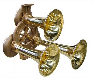
Photo: It is very hard to see the horn through the cat walk in this photo. Look for 3 trumpet shaped horns in the center of photo. I am including a photo from Kalenberg's site of a similar T-3 Horn.
From NHL Canes Instagram (thanks to hesnotherefor letting us know about this pic)
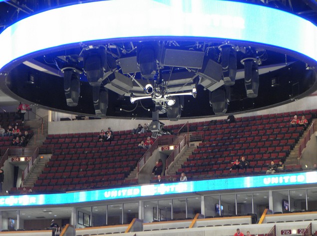


Chicago Blackhawks - United Center
Horn: Real
Type: Kahlenberg Q3
Location: Mounted under the center ice scoreboard. It is perhaps the leagues easiest to find!
Additional Info: It is the same horn that was mounted under the scoreboard at the old Chicago Stadium. The Blackhawks were the first team to use such a horn to celebrate a goal, thus beginnin the goal horn era.
Source: Numerous photos
Flickr: kielman316


Colorado Avalanche
Horn: Real
Type: Sounds like a Model KPH-130C Arena/Stadium Electric Piston Horn
Location: ?
Source:
Photo: This is NOT a photo of the exact horn inside Pepsi Center. This is a similar horn of that same model. While I have no proof that this is the exact model, it does look just like the one inside Sprint Center in Kansas City which has an almost identical sound.


Columbus Blue Jackets
Horn: Real
Type: ?
Location: Up in the rafters above the Scoreboard
Source: CBJ Organization 4/25/11
Flickr: foodbyfax


Dallas Stars
Horn: Real
Type: Similar to a Kahlenberg KDT-123
Additional Info: It is a real marine air horn that is placed inconspicuously in the rafters at American Airlines Center. A staff member sits in the press box at the arena and sounds the horn after a Stars goal.
Location: Up in the rafters above the Scoreboard
Source: Dallas Stars Customer Service
No Photo Available


Detroit Red Wings
Horn: Real
Type: Buell reed horn sets (These used high pressure reeds instead of diaphragms)
Additional Info: We use a real goal horn -- not a recording. In fact, we test it before every game before doors open.
Location: Up in the rafters above the neutral zone. There are two sets of horns which are clearly visible from many sections of the arena.
Source: Red Wings Event Services 4/21/11
Flickr: Jeff Hormann


Edmonton Oilers
Horn: Real
Type: Airchime 2-tone for truck usage
Location: Catwalk area above the scoreboard.
Additional Info: Oilers/Rexall Place Goal Horn is an actual air horn located in the ceiling of the building. It is triggered by just a click of the mouse from the arena's DJ. It will automatically blow for the preset time and shut itself off.
Source: Edmonton Oilers Hockey Club
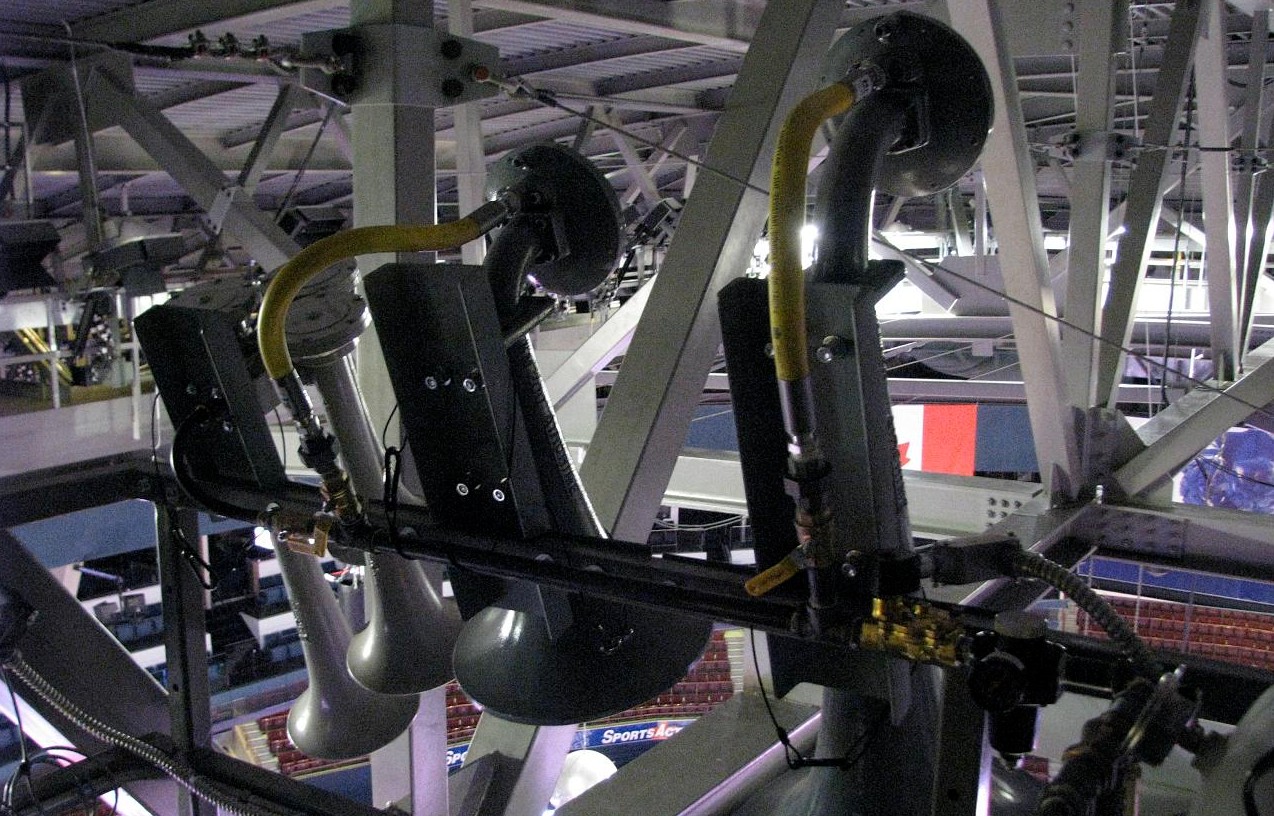

Florida Panthers
Horn: Real
Type: Kahlenberg D2 x 2 (2 sets on 360° bracket)
Location: Catwalk area above the scoreboard.
Additional Info: As you can see in the picture below, it would appear that one of the horns has some significant damage. I am very curious as to what caused that!
Source: Game Presentation Crew


Los Angeles Kings
Horn: Real
Type: Airchime K3, Canadian-voiced, bells, 1,2,3.
Location: In the rafters. Not sure if its over scoreboard or somewhere else.
Additional Info: There are actually two real horns that make the noise.
Source: LA Kings Organization 4/21/11
Flickr: Phos Chek


Click here for Part 2

Saddledome Recovery Right On Track

$
0
0
After a devastating flood, it is amazing to think that the Saddledome will be ready to go for the start of the NHL season. Here is a photo of the inside progress. Notice they have installed the new boards, glass and risers for the first several rows of seats.

Photo via instagram by tj344


Unpredictable Kings

$
0
0
When the Los Angeles Kings changed their primary logo to the "home plate" logo, everyone expected to see that primary at center ice, even though many did not like the idea. The Kings were wise to keep the crown at center ice with an updated color scheme. Just when we thought this center ice would remain the same for years to come, the King spoke and now the primary logo finds itself at center ice.


Even EA Sports was fooled when they tried to guess what the center ice would need to look like in NHL 12. They put the primary logo at center ice only to find out a few weeks later that it would not actually appear on the real Staples Center ice. In NHL 14 it will appear as the crown unless they are able to patch in the logo change at a later date, though in the past this has not happened.


So one question remains: How well will fans and players be able to see the puck over that black logo at center ice? Of course this is not the first black logo to appear at center ice... The Bruins come to mind. However this is perhaps the logo with the most black to appear at center ice. I have been asking around for opinions, and there seems to be a pretty even divide in opinions.

Some say that the logo will make it very difficult to see the puck, not so much for the players on the ice, but for those watching on TV. Others say that the action will only be at center ice for brief moments in the game and will be traveling fast enough that the distraction will be minimal.

One thing is for sure, if it creates any sort of problem, we won't have to wait too much longer to hear about it now! Comment below and weigh in on the debate!

2013 to 2014 NHL Ice Changes

$
0
0
Here we go for another year of comparing the new ice designs to the old ones. This could get ugly!


Anaheim did a nice job with the anniversary logo, but the red line is perhaps the worst use of their primary logo. Perhaps what is most aggravating to me about the red line is that last year they had a very unique design. Why on earth did they think they needed to be like everyone else, and use the Ducks's D in the line which looks awful. Bad Call


Boston had the perfect ice last year. After years of toying with new red line designs, I thought they had finally found the pattern that looked best with their primary logo. Just plain solid red. Though I am not surprised to see them change up the red line yet again, I am more than disappointed with their choice of unoriginal designs. The Bruins logo has appeared on the red line before. It didn't work then; it doesn't work now. Bad Call


Carolina's red line the past several seasons has matched the bottom of their jerseys. A black squares that represent a hurricane warning flag. This summer they unveiled brand new jerseys that replaced those squares with stripes. It appears that once again the red line will match the jerseys as they have switched to a long white stripe down the center of the line. I always wondered how they were ever allowed to use black in their red line. Though it was unique and quite clever, I was never a fan of how it simply made the red line appear darker on TV without really giving a good view of the design. The new red line is fresh, clean, and original. Good Call


Chicago changed their center ice this year. No really, they did. Okay, so just slight changes to the red line. Its hardly worth mentioning but I have to wonder if the subtle change had anything to do with making it easier to see the center dot. Or perhaps someone just didn't know what they were doing. I have no preference either way. No Call


Dallas had nowhere to go but up in my opinion. The anniversary logo wasn't much better than their old primary logo. This year they have a new logo, and a re-branded arena logo which gives the center ice a much cleaner look. Good Call


Florida is sporting a new anniversary logo this season, and though I usually do not like anniversary logos on ice... this one is pretty sharp. It's still not as pleasing to the eye as the large panther though. I prefer their diamond red line but at least they did not put tiny panther logos up and down the line. Whatever happened to the paw prints in the red line. That was also from a time where it wasn't cool to slap logos in the red line. I think its time for the return of the paw prints. Bad Call


Los Angeles is probably going to spark some debate on here. We all expected them to go with this new design back when the "home plate" logo became their primary mark. That did not happen and the rumors were going around that it was because of the difficulty it would create in tracking the puck over center ice. Well if that was the problem at the time, it apparently is not a concern any longer. Personally I liked the old crown at center ice. The home plate is sort of an eye sore. I look forward to hearing from the fans on this one! Nervously I type... Bad Call


New Jersey has had several variations of red line designs in their history. Surprisingly they all involve similar sized and spaced boxes. I have no idea why they keep tweaking them. I think it looked better last year though. Bad Call


Ottawa has a new arena name to show off at center ice this year. Not sure if I like the font or the layout as well as Scotiabank Place. The layout of the text last year seemed to fit the shape of the primary logo and help balance things out. This is a tough one for me... Bad Call


San Jose also got a new arena name, but it sure didn't change the look at center ice much. Not much at all. I think the new look might be just a bit more pleasing to the eye, but the name is not music to the ears. No Call


Tampa Bay has shed its anniversary logo this season to go back to it's primary logo which has not seen that much time on ice since it came into existence. Its not my favorite logo by any means, but it's simplicity is starting to grow on me. It is certainly refreshing to see it back at center ice. Good Call


Vancouver forgot to put their long time faithful red line design in last year. Or perhaps they just didn't bother since at the time the ice went in, they didn't even know if there would be a season at all. This year the diagonal pattern is back and looks as good as ever. Good Call


Now that you have heard my thoughts on the changes, please feel free to comment below and share your thoughts for the community!

Even The Scoreboard Didn't Show Up

$
0
0
Actually the scoreboard just wasn't ready for the Florida Panthers preseason home opener, and neither were the fans! It was a dreadful turnout for the Panthers first game back  at the BB&T Center. Although it was a Monday afternoon game, I have never seen a less attended game in the modern NHL era. Worse yet, I have seen bigger crowds for our local Mizzou college hockey team which has very few fans, even here in its hometown of Columbia.

Of course you can't base the team's status on one preseason game, especially a weekday afternoon game, however it does have to throw up a caution flag in the team offices regarding the future outlook.

Obstructed View - Barclays Center

$
0
0
Here are some of the beautiful views fans can expect when the Islanders move to the Barclays Center. Keep in mind there are plenty of great views around the arena, but I do find it odd that the NHL would allow them to play in this arena without some major reconstruction of the seating bowl. Takes me back to the Coyotes in America West Arena.


Red Line Focus

$
0
0
The red lines on the ice used to be one of the most overlooked aspects of the aesthetics of ice hockey. Of course they also used to be mostly made up of either white boxes or diamonds and lacked variety. In recent years this trend has changed and fans are starting to notice. It is always nice to see teams try something new with the red line to try to be original. For a while the introduction of a team's primary logo stamped on the red line was a new and exciting concept. It has been done sparingly throughout the 1990's and into the early 2000's but the idea really took off in the last 5 seasons. Now it is so common that the old diamond and box red lines have become endangered. Each season we expect to see a few more teams adopt the once unique and original primary logo in the red line concept. Some teams have taken this overused idea and tweaked it to make it more unique such as Nashville and Tampa Bay.

Most of the red lines today are not painted on the ice anymore. Instead they are reusable fabric with excellent water transfer properties for ease of installation. They also eliminate the "human error" factor that comes with hand painting lines and logos. These fabric logos are known as textile logos by Jet Ice who have been the leading ice company for the NHL for many years. They also provide paint and stencils for teams as well.

I have put together an informative graphic that shows off the red line designs for all thirty NHL teams below. We would love your feedback. Which are your favorites, least favorites, and what are your feelings on the current trend of red line designs?


Viewing all 773 articles
Browse latest View live


<script src="https://jsc.adskeeper.com/r/s/rssing.com.1596347.js" async> </script>